Web Manual: WYSIWYG Styles

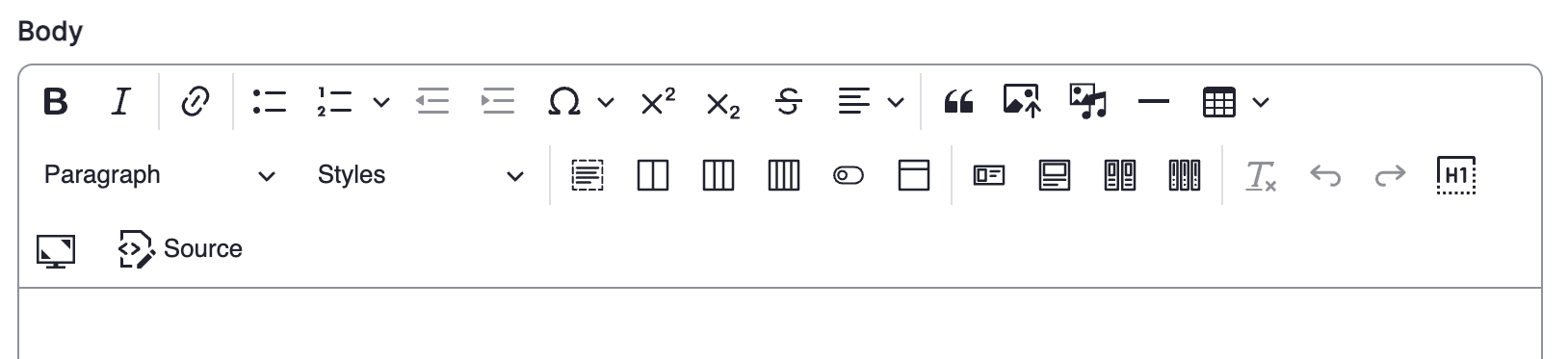
This page shows the styles available within the wysiwyg. It operates a bit like a Word document, allowing you to stylize your page without needing to use custom HTML. 

wysiwyg functions
The options above are the available functions within the wysiwyg. If you're unsure what each button in the wysiwyg is called, scroll your cursor over a button and wait a second. Help text will appear.

'Insert horizontal line' below


Table

No headercolumn 2; row 1
column 1; row 2column 2; row 2
column 1; row 3column 2; row 3


First row headerscolumn 2; row 1
column 1; row 2column 2; row 2
column 1; row 3column 2; row 3


First column headerscolumn 2; row 1
column 1; row 2column 2; row 2
column 1; row 3column 2; row 3


both headers (first column & row)column 2; row 1
column 1; row 2column 2; row 2
column 1; row 3column 2; row 3

Insert Columns with options (2 column option)

You can also insert 'columns with options' this one is a 2 column section. The insert 'keylines between columns' is selected for visual aid. Column widths are equal and vertical margin is normal

This is the second column. Increase distance between columns is not selected here. 

You can also insert 'columns with options' this one is a 2 column section. The insert 'keylines between columns' is selected for visual aid.

This is the second column. Increase distance between columns IS selected here. 

Large left column, with keylines selected, but not the increase distance option. Vertical margin is normal

This is the second column

This is the first column

Large right column, with keylines selected, but not the increase distance option. Vertical margin is normal

first column: equal width, keylines, and small vertical margin selected

second column

first column: equal width, keylines, and large vertical margin selected

second column

first column: equal width, keylines, and x-large vertical margin selected

second column

Insert Columns with options (3 column option) 

first column: equal width, keylines, and normal vertical margin selected

second column

third column

Insert Columns with options (4 column option) 

first column: keylines, and normal vertical margin selected

column width not available for changing on the 4 column option

second column

third column

fourth column

 Insert a horizontal card

Note the image is just a placeholder image. You will have to upload and insert your own image when you create the card.

Horizontal Card Title

The background colour was selected as a default option which has no colour and no shadow toggled. Text region right was selected as the Content Direction. Button below is a preset that you can click and adjust, or just delete. These cards don't seem to allow 'bold' text, only 'italics.'

Horizontal Card Title

The background colour was selected as thelight grey option with the toggle shadow selected. Text region left was selected as the Content Direction. Button below is a preset that you can click and adjust, or just delete.

Insert a card 

One Card Title

The background colour was selected as the light grey option. Button below is a preset that you can click and adjust, or just delete.

Insert two cards 

Insert Two Cards Title 1

The background colour was selected as the light grey option. Button below is a preset that you can click and adjust, or just delete.

Insert Two Cards Title 2

The background colour was selected as the light grey option. Button below is a preset that you can click and adjust, or just delete.

Insert Three Cards Title 1

The background colour was selected as the light grey option. Button below is a preset that you can click and adjust, or just delete.

Insert Three Cards Title 2

The background colour was selected as the light grey option. Button below is a preset that you can click and adjust, or just delete.

Insert Three Cards Title 3

The background colour was selected as the light grey option. Button below is a preset that you can click and adjust, or just delete.

Some more Horizontal Cards (to show the colour choices)

Unit Tertiary Colour

The background colour was selected as a unit tertiary colour option. Text region right was selected as the Content Direction. Button below is a preset that you can click and adjust, or just delete. These cards don't seem to allow 'bold' text, only 'italics.'

Unit Accent Colour

The background colour was selected as a unit accent colour option. Text region right was selected as the Content Direction. Button below is a preset that you can click and adjust, or just delete. These cards don't seem to allow 'bold' text, only 'italics.'

UBC Blue

The background color was selected as a UBC Blue option. Text region right was selected as the Content Direction. Button below is a preset that you can click and adjust, or just delete. These cards don't seem to allow 'bold' text, only 'italics.' Typically, the text would show up black, but you can adjust this to be white text by going into the "Styles" dropdown on the wysiwyg and select the White Text option.

UBC Blue: Sea

The background color was selected as a UBC Blue: Sea option. Text region right was selected as the Content Direction. Button below is a preset that you can click and adjust, or just delete. These cards don't seem to allow 'bold' text, only 'italics.' Typically, the text would show up black, but you can adjust this to be white text by going into the "Styles" dropdown on the wysiwyg and select the White Text option.

UBC Blue: Cobalt

The background colour was selected as a UBC Blue: Cobalt option. Text region right was selected as the Content Direction. Button below is a preset that you can click and adjust, or just delete. These cards don't seem to allow 'bold' text, only 'italics.' Typically, the text would show up black, but you can adjust this to be white text by going into the "Styles" dropdown on the wysiwyg and select the White Text option. The 'Read more' button below is the transparent button option.

UBC Blue: Neptune

The background color was selected as a UBC Blue: Neptune option. Text region right was selected as the Content Direction. Button below is a preset that you can click and adjust, or just delete. These cards don't seem to allow 'bold' text, only 'italics.'

UBC Blue: Cornflower

The background color was selected as a UBC Blue: Cornflower option. Text region right was selected as the Content Direction. Button below is a preset that you can click and adjust, or just delete. These cards don't seem to allow 'bold' text, only 'italics.'

UBC Blue: Polar

The background color was selected as a UBC Blue: Polar option. Text region right was selected as the Content Direction. Button below is a preset that you can click and adjust, or just delete. These cards don't seem to allow 'bold' text, only 'italics.'

UBC Blue: Frost

The background color was selected as a UBC Blue: Frost option. Text region right was selected as the Content Direction. Button below is a preset that you can click and adjust, or just delete. These cards don't seem to allow 'bold' text, only 'italics.'


Musqueam First Nation land acknowledegement

We honour xwməθkwəy̓ əm (Musqueam) on whose ancestral, unceded territory UBC Vancouver is situated. UBC Science is committed to building meaningful relationships with Indigenous peoples so we can advance Reconciliation and ensure traditional ways of knowing enrich our teaching and research.

Learn more: Musqueam First Nation

Faculty of Science

Office of the Dean, Earth Sciences Building
2178–2207 Main Mall
Vancouver, BC Canada
V6T 1Z4
UBC Crest The official logo of the University of British Columbia. Urgent Message An exclamation mark in a speech bubble. Arrow An arrow indicating direction. Arrow in Circle An arrow indicating direction. A bookmark An ribbon to indicate a special marker. Calendar A calendar. Caret An arrowhead indicating direction. Time A clock. Chats Two speech clouds. External link An arrow pointing up and to the right. Facebook The logo for the Facebook social media service. A Facemask The medical facemask. Information The letter 'i' in a circle. Instagram The logo for the Instagram social media service. Linkedin The logo for the LinkedIn social media service. Lock, closed A closed padlock. Lock, open An open padlock. Location Pin A map location pin. Mail An envelope. Mask A protective face mask. Menu Three horizontal lines indicating a menu. Minus A minus sign. Money A money bill. Telephone An antique telephone. Plus A plus symbol indicating more or the ability to add. RSS Curved lines indicating information transfer. Search A magnifying glass. Arrow indicating share action A directional arrow. Spotify The logo for the Spotify music streaming service. Twitter The logo for the Twitter social media service. Youtube The logo for the YouTube video sharing service.