Web Manual: WYSIWYG Functions
This page shows the available functions within the wysiwyg which is available across many content types. It operates a bit like a Word document, allowing you to stylize your page without needing to use custom HTML. This guide will go over some of the tricky elements and the less common elements.
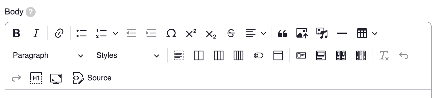
Add a link to a URL or internal page
There are a few ways to add a link onto your page.
- Highlight the text you would like to link.
- Clicking on the link button
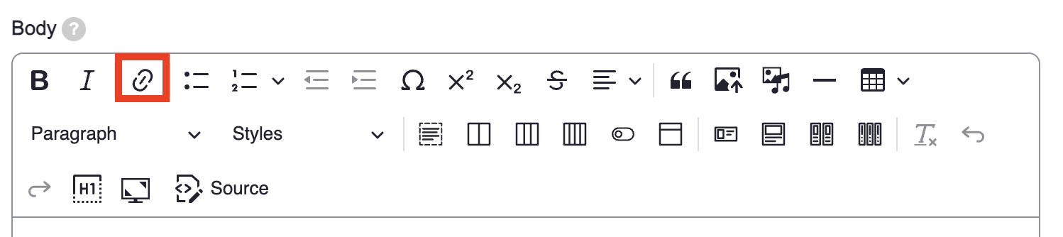
- A box will pop up with the Link URL field. In this field you have two options:
Add a link to a URL
Enter the external URL that you want into the Link URL field. For example, if you wanted to link the UBC page, you can type in https://www.ubc.ca/ into the field.
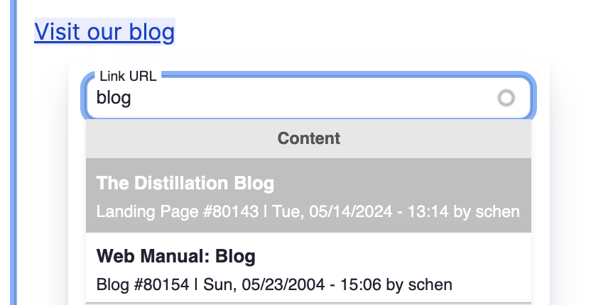
Add a link to an internal page
Type in the title of a page on your site (let's use the Distillation Blog as an example). The page title will pop up as a content option in a dropdown. Select the item you want to link and it will connect to the node URL. The node URL ensures that this link will always link to the selected page, even if you change the URL for the linked page later on. (see image below)
Lastly, click the green check mark to save! This is important.
Tip: Something new on Drupal 10 is that you can now 'copy' a link, highlight the text you want to add the link to, and 'paste.'
Add link to a file
- Highlight the text you would like to link.
- Clicking on the link button
- To link a file that is hosted on your site, go to the Content section in the left sidebar, select Files. In the Files section, left click on the file you want to attach, select Copy Link Address, copy the link into the Link URL (lets use https://science.ubc.ca/sites/default/files/logo/ubcscience-eletterhead… as an example), delete the base URL portion of the URL (so
https://science.ubc.ca/sites/default/files/logo/ubcscience-eletterhead.doc becomes /sites/default/files/logo/ubcscience-eletterhead.doc). - Click the green check mark to save! This is important.
Upload image from computer
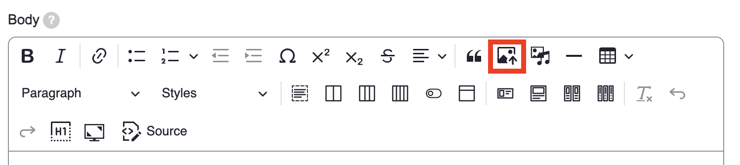
The Upload image from computer is an easy and straightforward way to add an image to your page. To do so:
- Select the Upload image from computer from the wysiwyg. A file pop-up will appear, allowing you to select and insert the image of your choice.
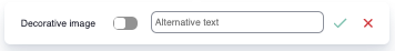
- Once your image has been inserted, you will need to add Alternative text to describe your image. Here is an helpful guide to help you write an excellent description. For accessibility purposes, we now required to include Alternative text for your images. The exception is for Decorative images which you can toggle. Read more about what makes a decorative image here.
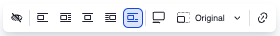
- There are a few display options for your image as well. This operates similarly to uploading an image on a Word doc, where you can adjust the alignment and spacing of your image. One nice thing about the new Upload image from computer option is that you can now easily use the Toggle caption on to add a caption on your image neatly.
Insert media
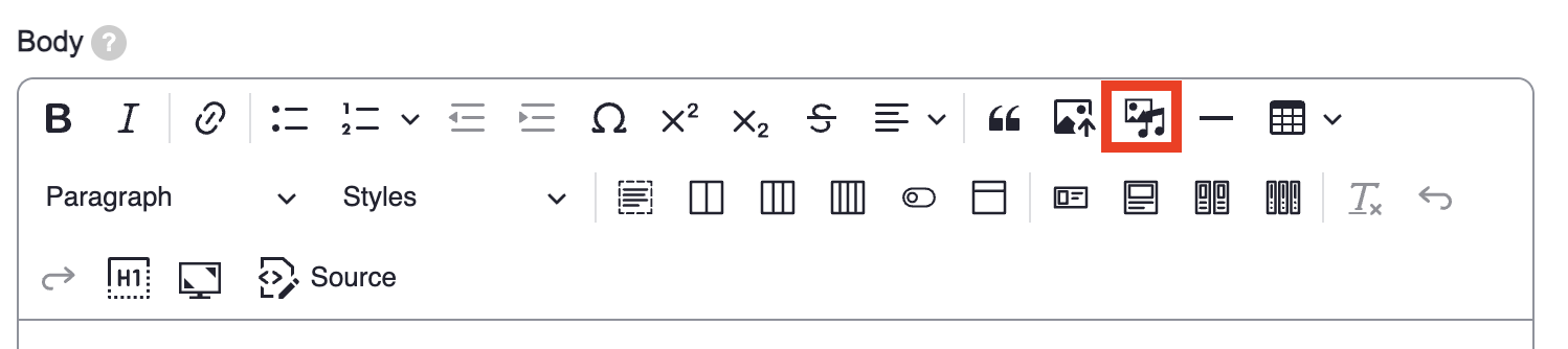
This is a useful tool when you are uploading media that is not an image. For UBC Science websites, we recommend using this for adding videos. In some cases where you will have to use this function (ex. in the card options of the wysiwyg). To use the Insert Media:
- Click on the Insert Media button in the wsywig. A screen will pop up.
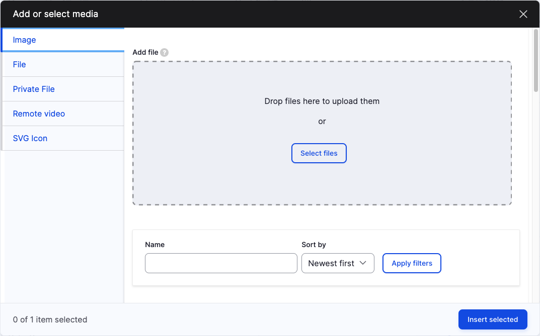
- Select Remote video option on the left sidebar.
- In the Add Remote video via URL field, insert your video link.
- Click Add.
- Then click Insert selected to place your video.
If you would like to insert a video you have already added to the Remote video files in the past, you can scroll through the uploaded videos to select the one you would like to insert.
Color Box
The Color Box button allows you to put text in a coloured box. This can be used to highlight important notices or bring attention to a specific section of your web page. To create a box:
- Select the Color Box option. A box will pop up in your body section of the page.
- Add text to the inside of the box.
- Click inside the box and a series of options will popup.

- You can play around with the box options to get your desired effect. If you select an option, the box will automatically update to reflect your selection.
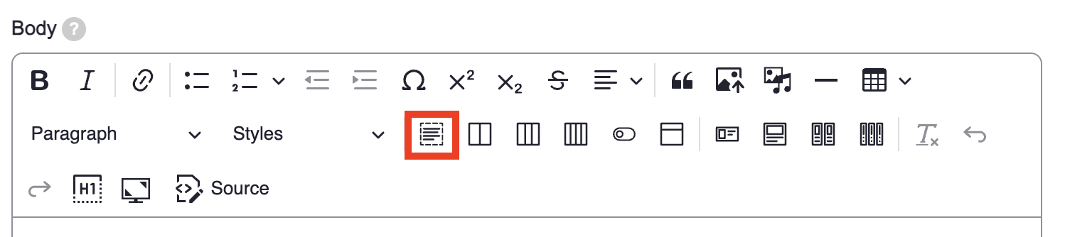
Insert a Table
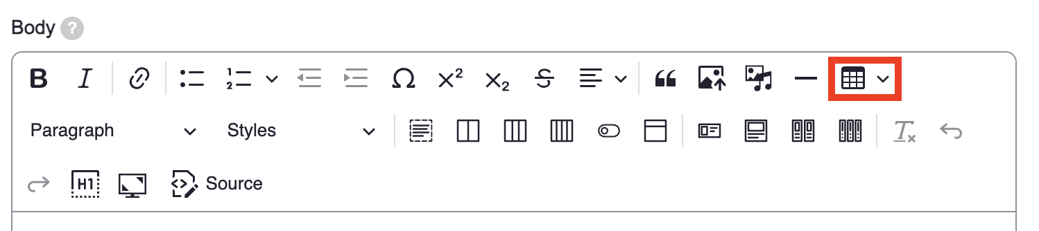
To insert a table is as simple as adding a table on a Word doc. Simply select the Insert table function and select the number of rows and columns you'd like to add from the dropdown menu. Once selected, a table will pop into the body section of your wysiwyg.
If you click into the table, there are a few customizations that pop up. You can see a list of options below:
- Column
- Row
- Merge cells
- Toggle caption on
- Table cell width
- Table style
For example:
| The 'Header Row' has been toggled from the row section. | |
|---|---|
| However, the 'Header Column' is not toggled here in the column section. | The table style is set to stripe on hover. |
| This column's table cell width has been set to column width: 1/3 |
Add a Card to your page
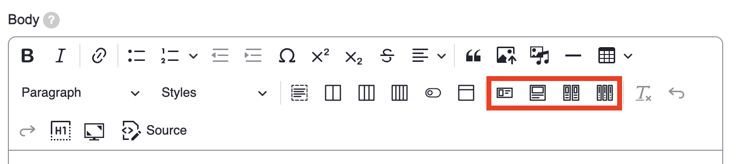
You can add custom cards into your page by selecting one of the card options. You have 4 options in the wysiwyg:
- Horizontal Card
- Vertical Card
- Two Vertical Cards
- Three Vertical Cards
For this example, let's select the Horizontal Card. When you select this option, a card like the one below will pop up:
Sample Title
Sample Text
Now it's time to customize the card:
- When you click into the card, a series of options will pop up. You can play around with these options to get the style that you are seeking.

- The 300 x 300 image is also a placeholder image which shows up as the big red x that you see above. You can delete this and use the Upload image from computer option on the wysiwyg to insert a new image. It is best to consider the dimensions of the image you upload, especially if you want to create multiple cards. For example, an square image like the placeholder might be a good option to consider for a consistent look and feel. Don't forget to add alt-text to your image.
- You can replace the text and link in for the Learn more placeholder text at the bottom of the card.
Adding an Accordion
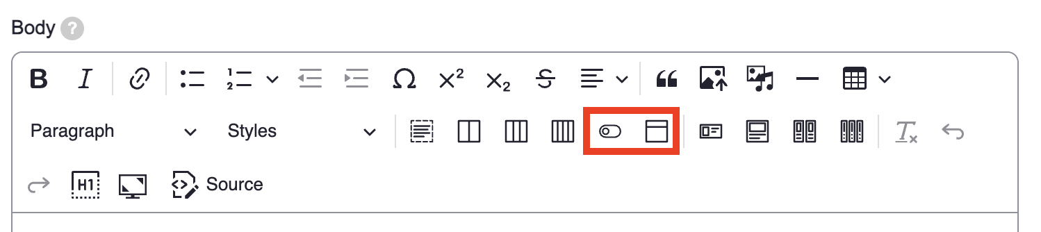
To add an Accordion is very simple on Drupal 10. Select the Accordion option from the wysiwyg. A box with two cells will show up on your page. Type the content header (or the visible part) in the top box. Type in the additional information (or the hidden text) in the bottom box. You can add more accordions by inserting a additional accordions below each other.
You can also select the Toggle All Accordions option to insert a button that will toggle all of the accordions on your page to open or close. Usually this is placed on top of your accordions. Below is an example of what the button looks like. You can click on it to see how it works.
Last updated on: July 10, 2025